pacman::p_load(tidyverse, maps)9 Human geography lab 2
The following packages will be required for this chapter:
9.0.1 World map
The
mapspackage contains data for the world, USA, France, Italy and New Zealand. It contains information such as latitude, longitude, group, region, etc. like this.First call the world map data
You can see the data structure by using
headcommand.
world_map <- map_data("world")
head(world_map)
long lat group order region subregion
1 -69.89912 12.45200 1 1 Aruba <NA>
2 -69.89571 12.42300 1 2 Aruba <NA>
3 -69.94219 12.43853 1 3 Aruba <NA>
4 -70.00415 12.50049 1 4 Aruba <NA>
5 -70.06612 12.54697 1 5 Aruba <NA>
6 -70.05088 12.59707 1 6 Aruba <NA>- By using the
ggplot2boundaries can be drawn withgeom_polygon()with latitude and longitude as shown in Figure 9.1
world_map %>%
  ggplot(aes(x = long, y = lat, group = group)) +
geom_polygon(fill = "lightgray", colour = "black", size = 0.1) 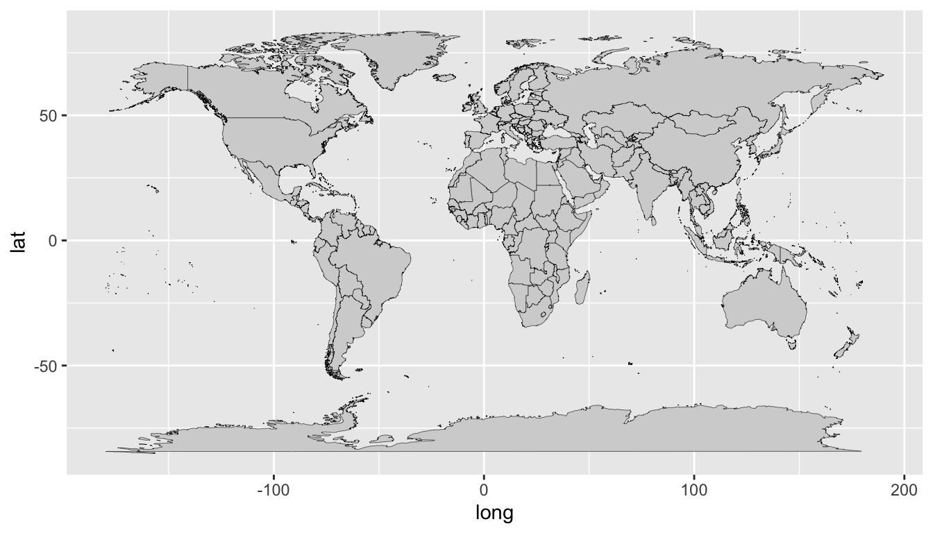
9.0.2 Japan map
If we limit the data with
filter(), we can also draw a map of specific countries.For instance, we will filter the data for Japan and draw a map as shown in Figure 9.2
world_map %>%
  filter(region == "Japan") %>%
  ggplot(aes(x = long, y = lat, group = group)) +
  geom_polygon(fill = "lightgray", colour = "black", size = 0.1)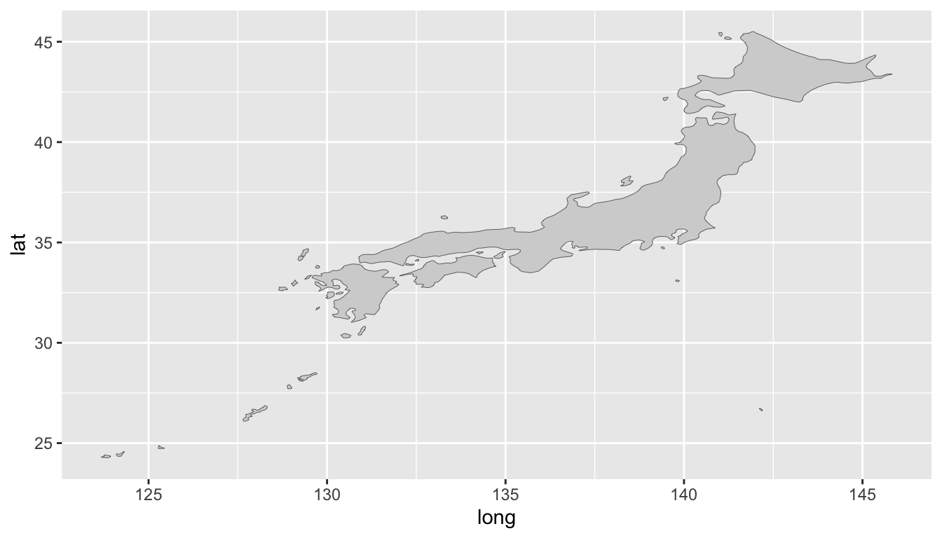
- We will change the color of Japan map and draw a map as shown in Figure 9.3
world_map %>%
  filter(region == "Japan") %>%
  ggplot(aes(x = long, y = lat, group = group)) +
  geom_polygon(fill = "blue", colour = "black", size = 0.1)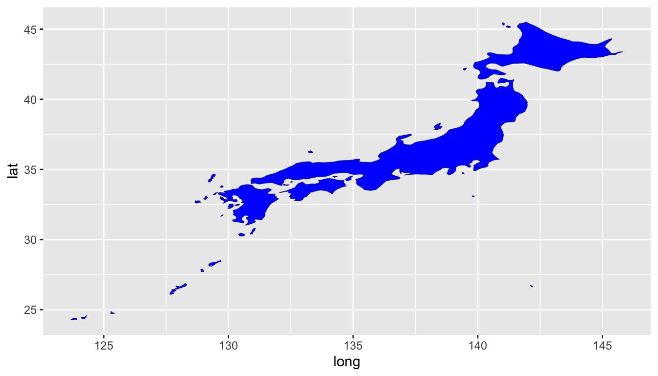
- We will filter the data for China and draw a map as shown in Figure 9.4
world_map %>%
  filter(region == "China") %>%
  ggplot(aes(x = long, y = lat, group = group)) +
  geom_polygon(fill = "red", colour = "black", size = 0.1)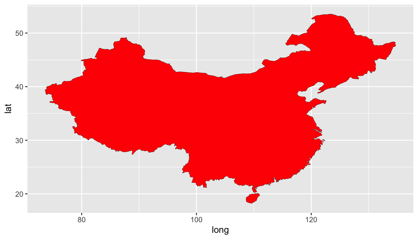
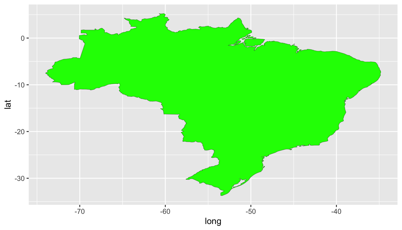
- We will filter the data for Brazil and draw a map as shown in Figure 9.5
world_map %>%
  filter(region == "Brazil") %>%
  ggplot(aes(x = long, y = lat, group = group)) +
  geom_polygon(fill = "green", colour = "black", size = 0.1)